How common is drawing Л the way similar to Greek letter Λ in modern Russian? Does it vary depending on region?
-
2Sure, the Greek font. :)– KCdCommented Jun 4, 2013 at 16:29
-
1@Anixx, you can find many such fonts at paratype.ru, for example. The flat-top Л seems to be more common because it allows more uniform letter spacing when typesetting.– mustaccioCommented Jun 4, 2013 at 17:27
-
2@KCd Greek is not Cyrillic.– AnixxCommented Jun 4, 2013 at 17:29
-
1@Anixx: I know. What I wrote before was meant as a joke (hence the :) after it) since you did ask about any font...– KCdCommented Jun 4, 2013 at 18:49
-
2@mustaccio In Russian there a lot of letters that do not have same width as п or н: д, ж, ш, щ, ц, ы, ю. Some letters, though optically have "standard" size, in fact are wider and/or taller - о, с, э. The same characters are used in Ukrainian, where letter і is used. So, in most fonts there is no such thing as "uniform letter spacing" with exception of monospaced (or console) fonts (Courier New, or Lucida Console). Potentially each pair of symbols may have specially calculated distance (this is called kerning). So, uniform letter spacing cannot be the reason why flat-top Л is preferred over Λ.– ArtemixCommented Jun 10, 2013 at 7:19
2 Answers
In short: angle-shaped Л is common to texts written by the hand (handwriting and block letters). In fact non-angle-shaped Л is not used at all in such cases.
For printed fonts non-angle-shaped Л is common (roughly 90% vs 10%), though it may be used for artistic effect or to add classic-style flavor to the text.
Actually angle-shaped Л is always used when you write block letters by the hand. It is because it is much simple to draw. (In fact, maybe this is the reason why "hand written" MS Comic Sans font looks unnatural to me, because they use Л instead of anlge-shaped letter).
Here is how the children are taught to write this letter (taken from question about italic т):

The Russian Wikipedia states that current non-angular shape of the letter was first introduced back in 1840 and later become very popular in Russian typographics. Though in many artistic fonts the angular-shaped letter is still used. For expample here you can see the titles of Petersburg subway stations. Most of them use the angle-shaped letter.
Here is a post about shapes of Л by Юрий Гордон, the author of the book Книга про буквы от Аа до Яя. It is interesting to note that in most fonts when the angle-shaped Л is used, then Д also has such form. And when Л is more like П then Д also has similar form.
As for printed media - some academic books use fonts with angle-shaped letter, for example "Литературные памятники" series that was established back in 1951. Here is an example of covers of books printed in 2012, 1983 and 2011 (last one is from some other series):
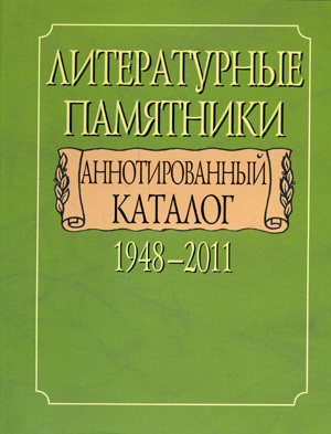
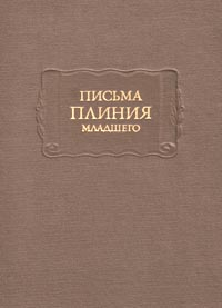
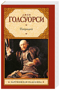
As seen in the street:
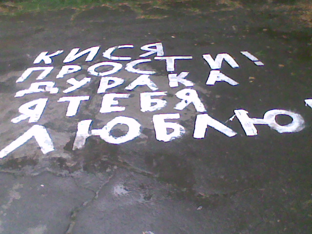
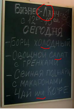

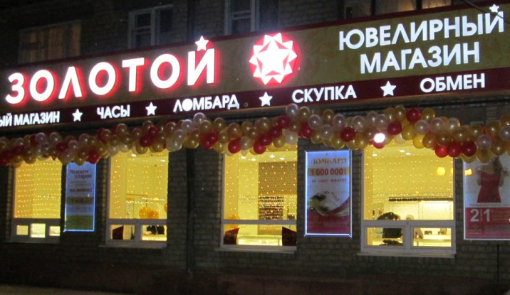
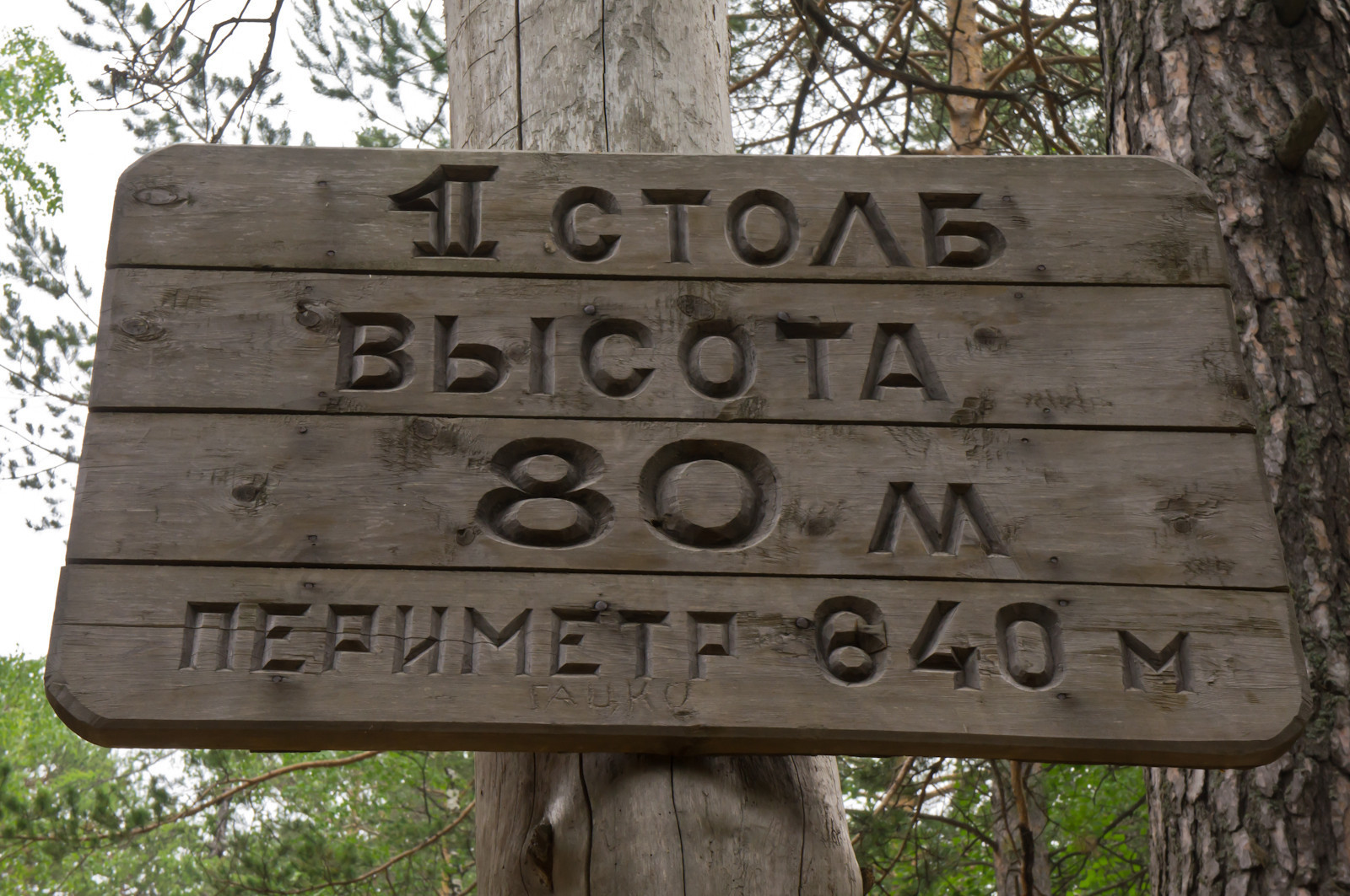
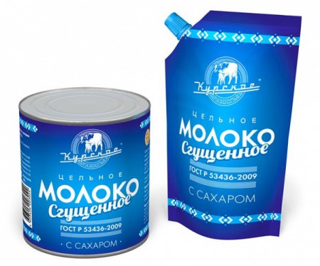
Fonts with such letter were popular back in 50-s (because of Constructionism art movement that preferred simple geometric forms), so you can frequently see it on objects created in those times, or ones that have retro-design:
-
1
Well I've never seen it in printed media and I've never met a font using this shape for «л». I'm afraid it will be a bit difficult to recognise, but, well, as part of a logo it might be fine (I don't remember any logos with Λ though).
Also note that it is more common to use it instead of «A» in logos.
Update. Here are some fonts:
- ITC Kabel Book
- Hypatia Sans
- Romul
- Trojan (famous for its appearance on every other movie cover)
-
3
-
As for the printed media, here are some examples: audiozvuk.com/foto/491.jpg mirknig.com/uploads/posts/2008-04/1208763579_kolobok.jpg azbookvarik.ru/media/images/books/skazkistikhi/…– AnixxCommented Jun 4, 2013 at 17:34
-
@Anixx That's what I call “logo”. I can't imagine reading long text with this shape instead of «л». Commented Jun 4, 2013 at 17:36
-
@Anixx Kid's books always tend to use sans fonts and this Λ is kinda super-sans. Commented Jun 4, 2013 at 17:53
-
@kirelagin I just want to add that there are more common fonts that use the triangular shape. For aesthetic purposes, Bannikova, Academic and Lazursky fonts are occasionally used in literature (Банниковская, Академическая, гарнитура Лазурского). These all have triangular Д and Л, and the first two generally use "antiquiated" design (Bannikova was researching 18th century designs to make her typeface). Commented May 4, 2015 at 2:41